Zillah School District
>Branding >Illustration
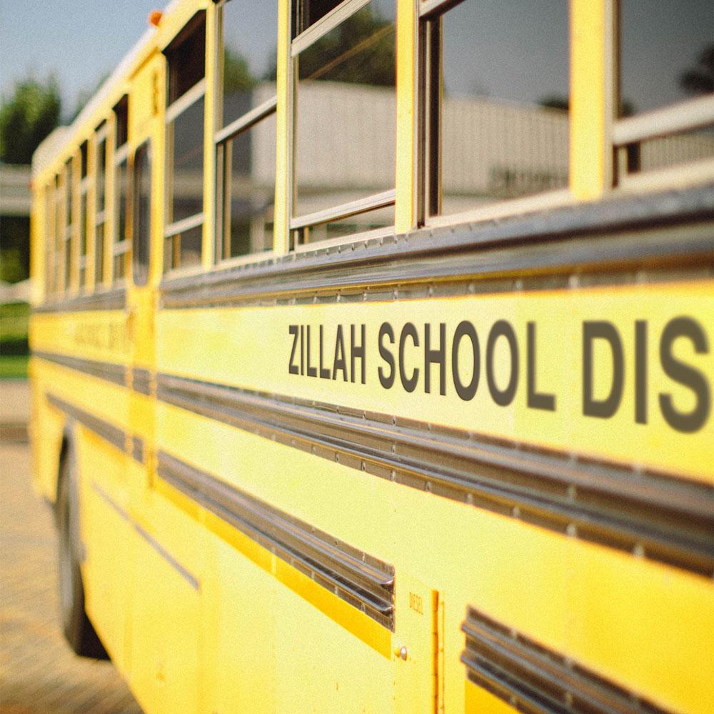
ZSD is small rural district serving Zillah, WA. Zillah is one of the smallest districts in area in Yakima County. Business and industry in the district boundaries are: diversified agriculture and agriculture related service industries including several diversified fruit packing and shipping operations, wineries, and agriculture management.
Services
Identity System
Logos, Illustrations, Icons
Custom Typography
Brand Merchandise & Apparel
Art Direction
Challenges
With a growing number of students, recent construction, and an inconsistent brand voice, ZSD needed a cohesive identity. Firstly, there was a need for an internal identity that would help unify the four schools within the district: Elementary, Middle, Intermediate, and High school. Before the rebrand, Zillah had a range of different images, logos, fonts, etc. that they used, without having a consistent brand or even default logo.
Outcomes
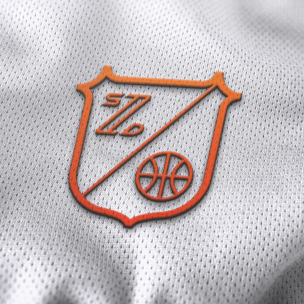
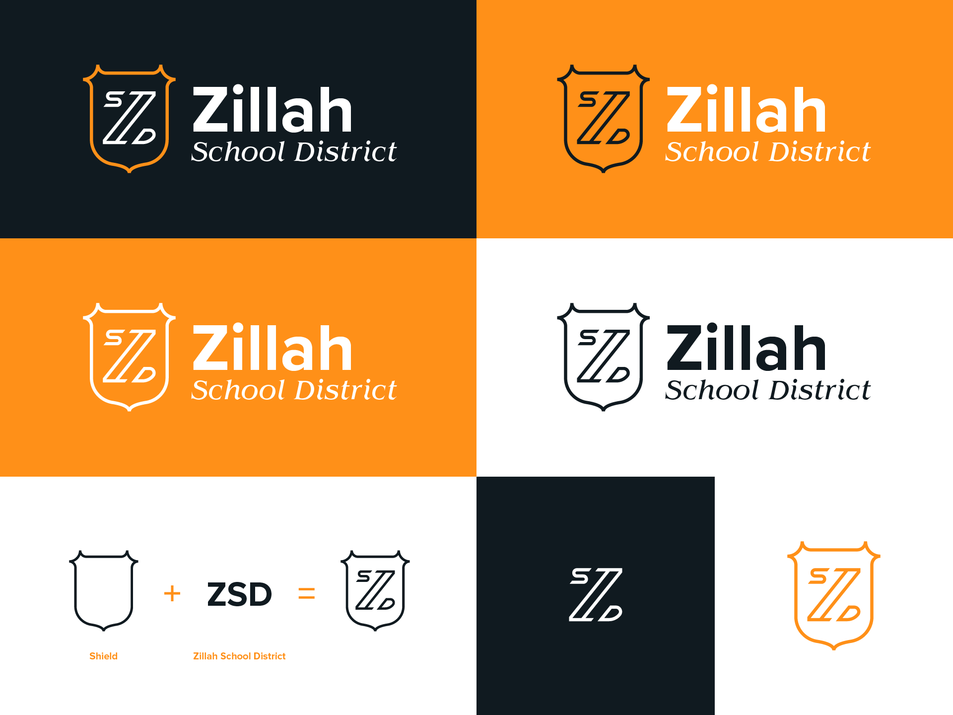
After collecting and reviewing all of these files, the design they seemed to gravitate towards the most when speaking internally was a lockup of a Z, S, and D. Even though their mascot is a leopard, they preferred not to include that unless speaking externally. After exploring initial logo options and some back and forth, this monogram of a Z with the letters S and D embedded in it was created, and was the most simple and successful direction.
There was much more than just a logo to develop. A whole system needed to be created to fill the need of the entire district.
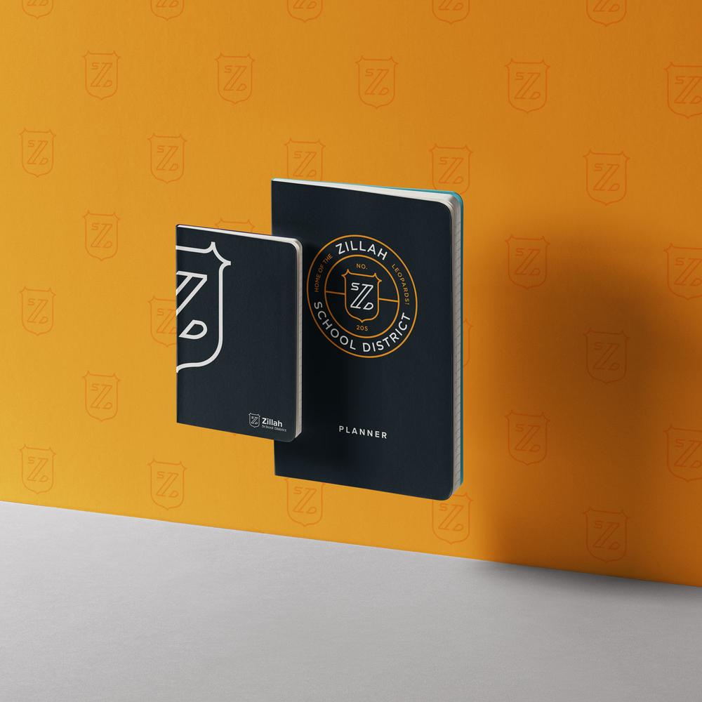
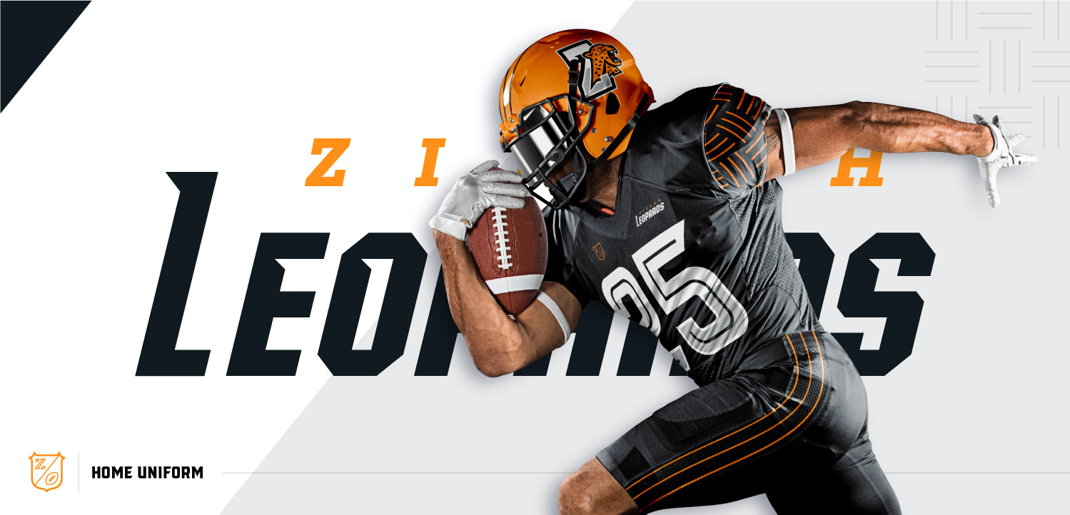
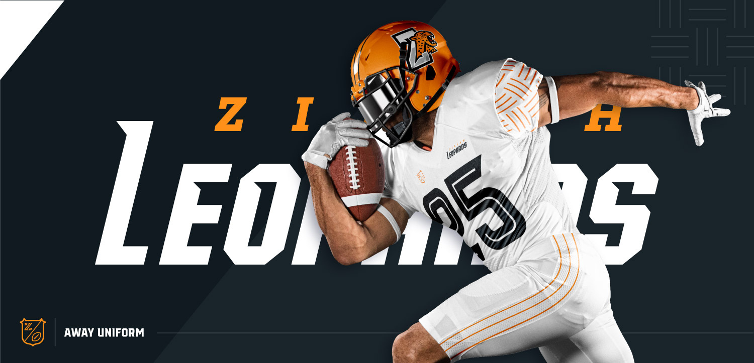
All geared up.
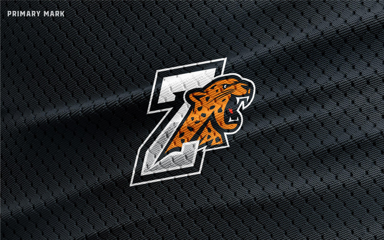
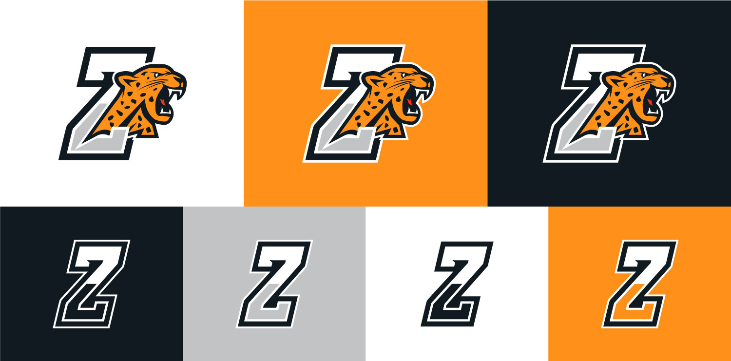
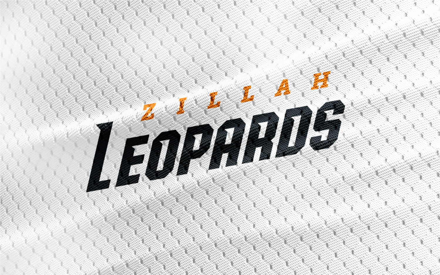
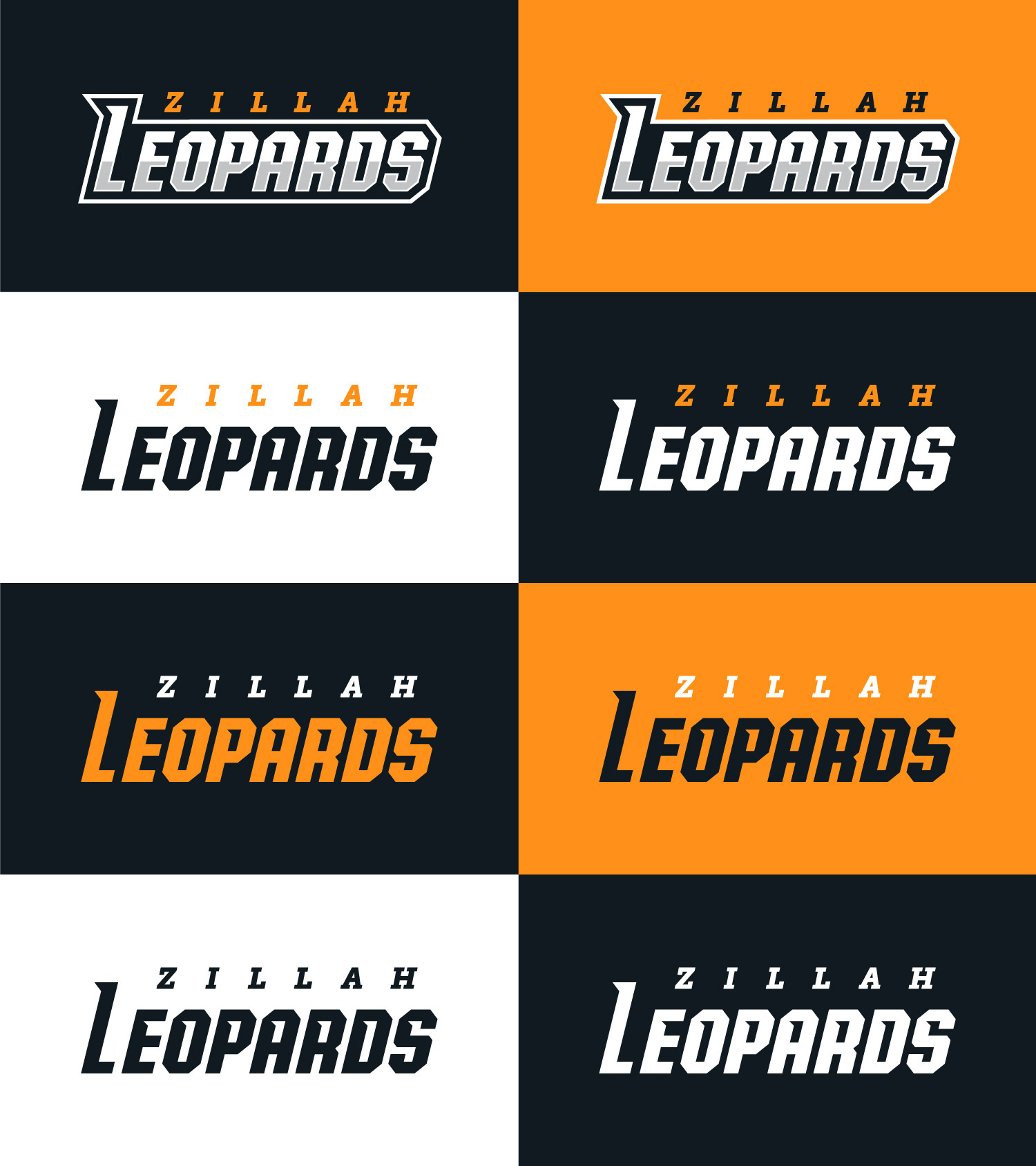
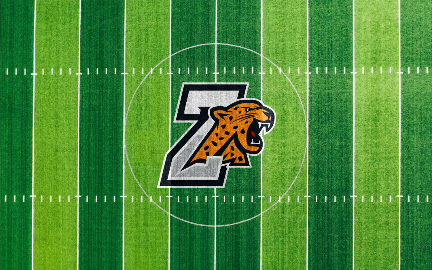
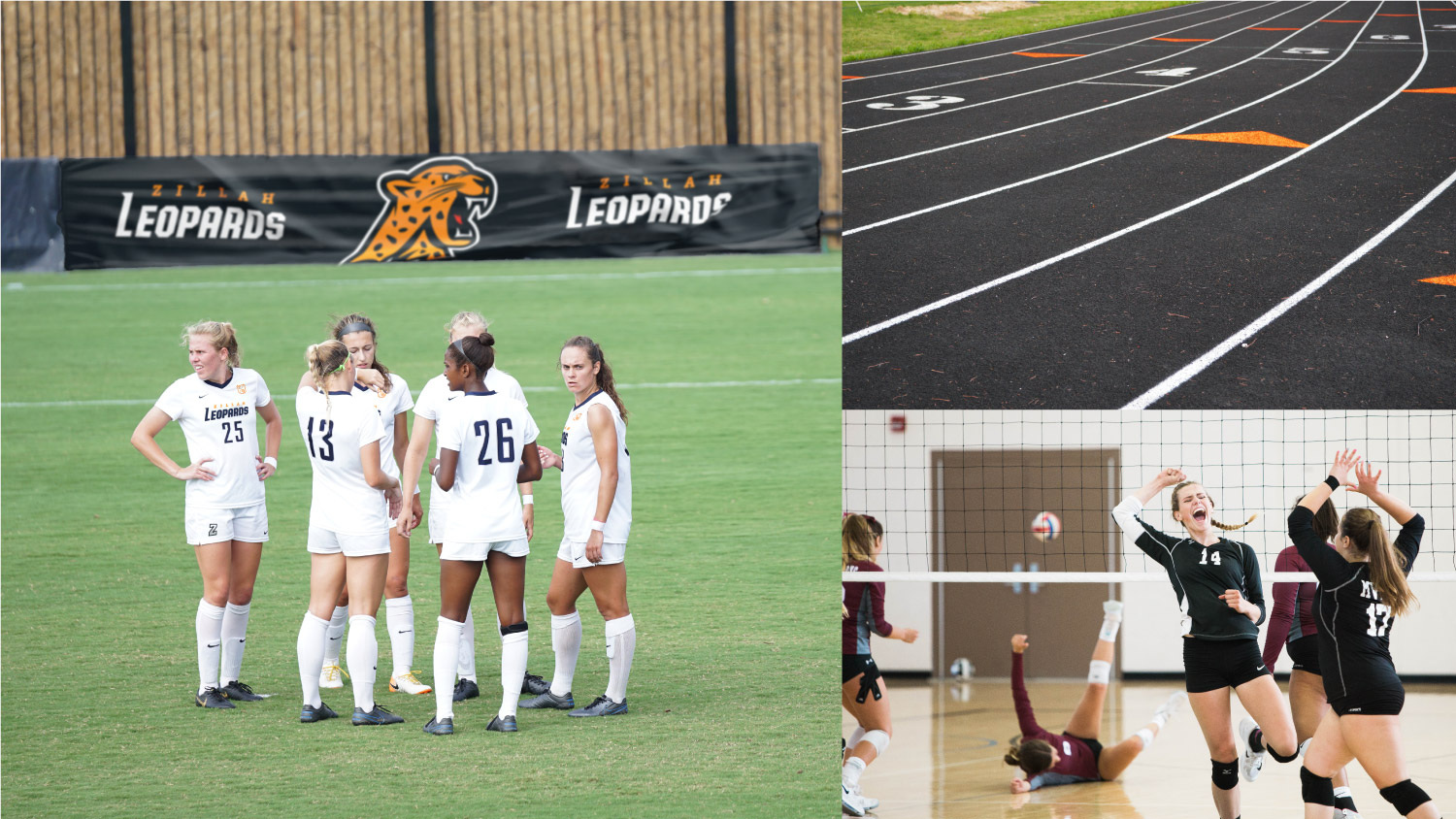
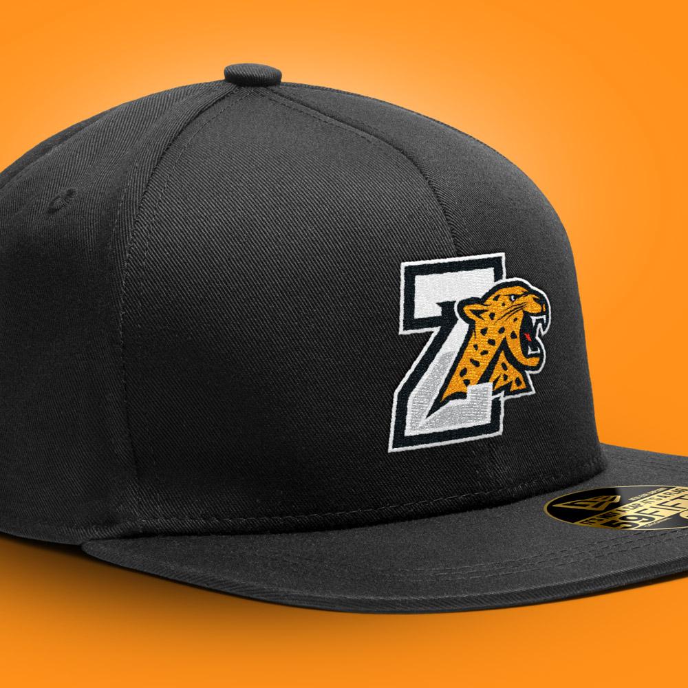
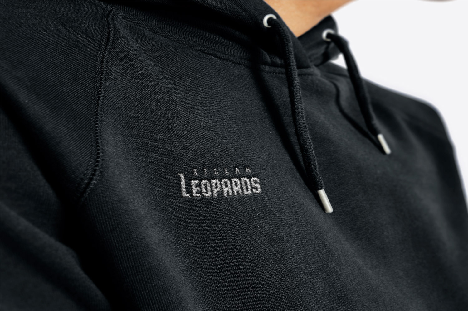
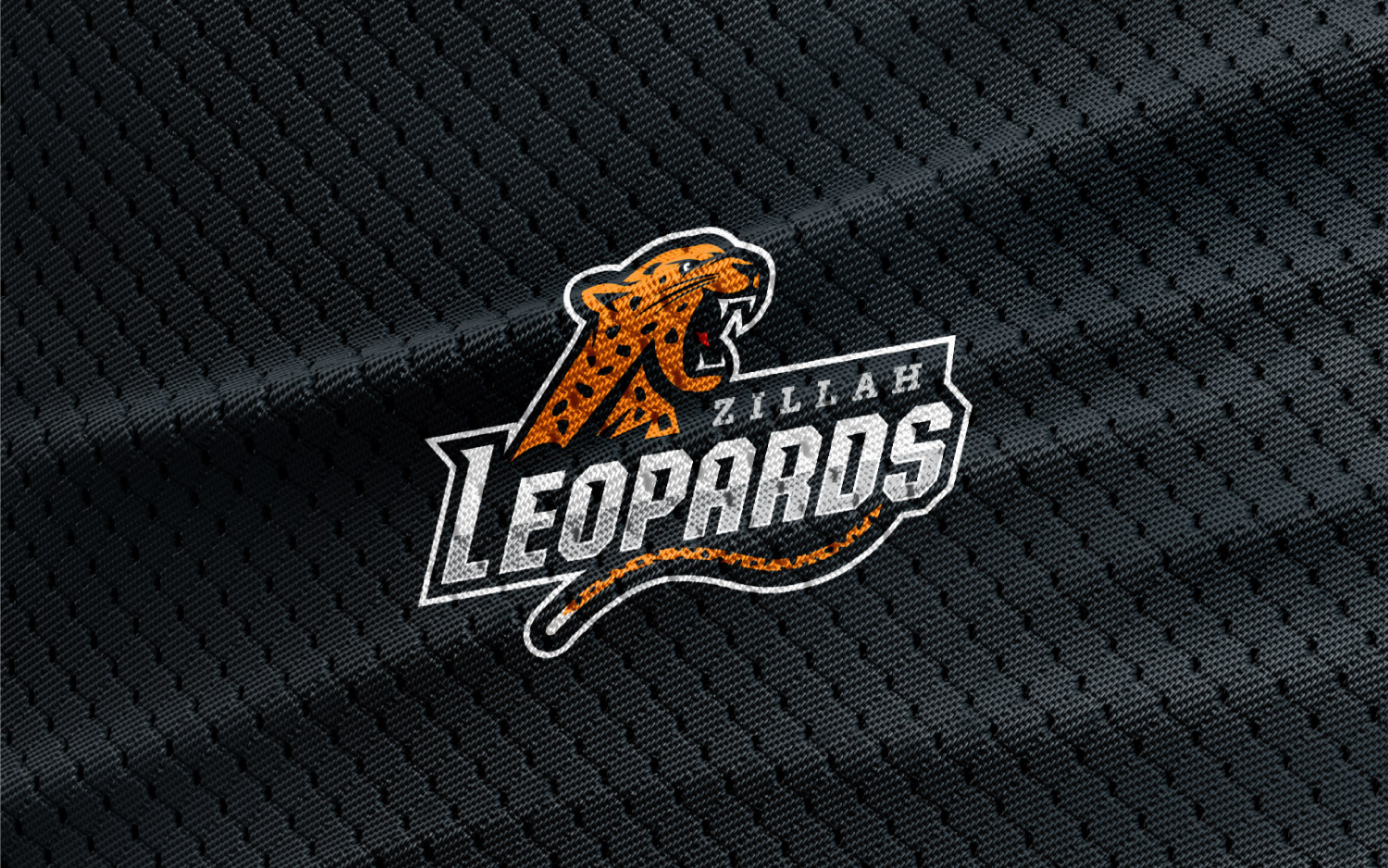
Developing the school district branding helped to unify the district under a consistent identity and voice. Focused on education, the school district logo is more of an internal brand. This branding worked well for the school, but isn’t fierce enough to fully represent the sporting opportunities at Zillah. The sporting logo was created to unify the schools under one mascot, and give a face to the district as a whole. The district and sports branding aren’t meant to separate the school, but to work together to promote education and activity.
The sports logo borrows the district color palette, flipping the light for dark. The goal was to create a mark that evoked passion, forward momentum, and fear in their opponents. Iconography was created to represent each sport offered at the school, and can be used as patches on all of the sports gear to bring the two logos together.