Yakima Valley Hops
>Branding >Packaging
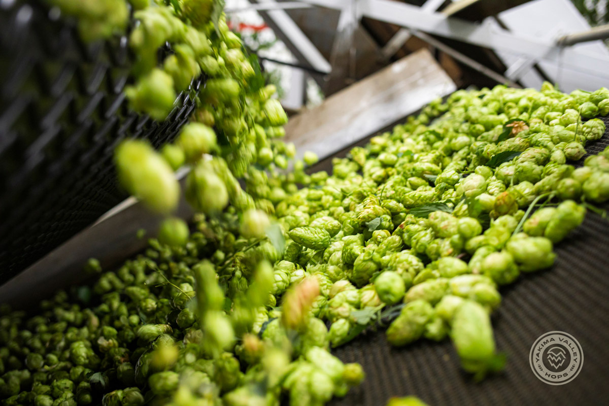
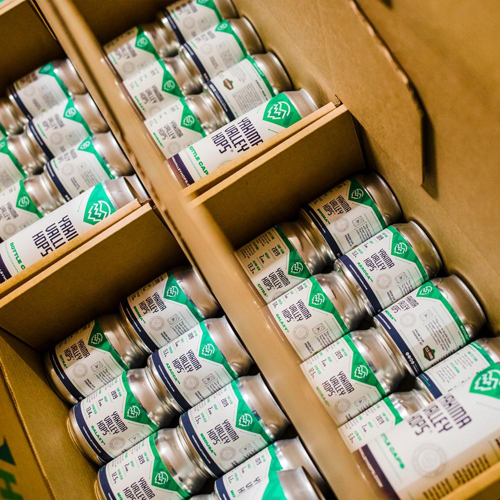
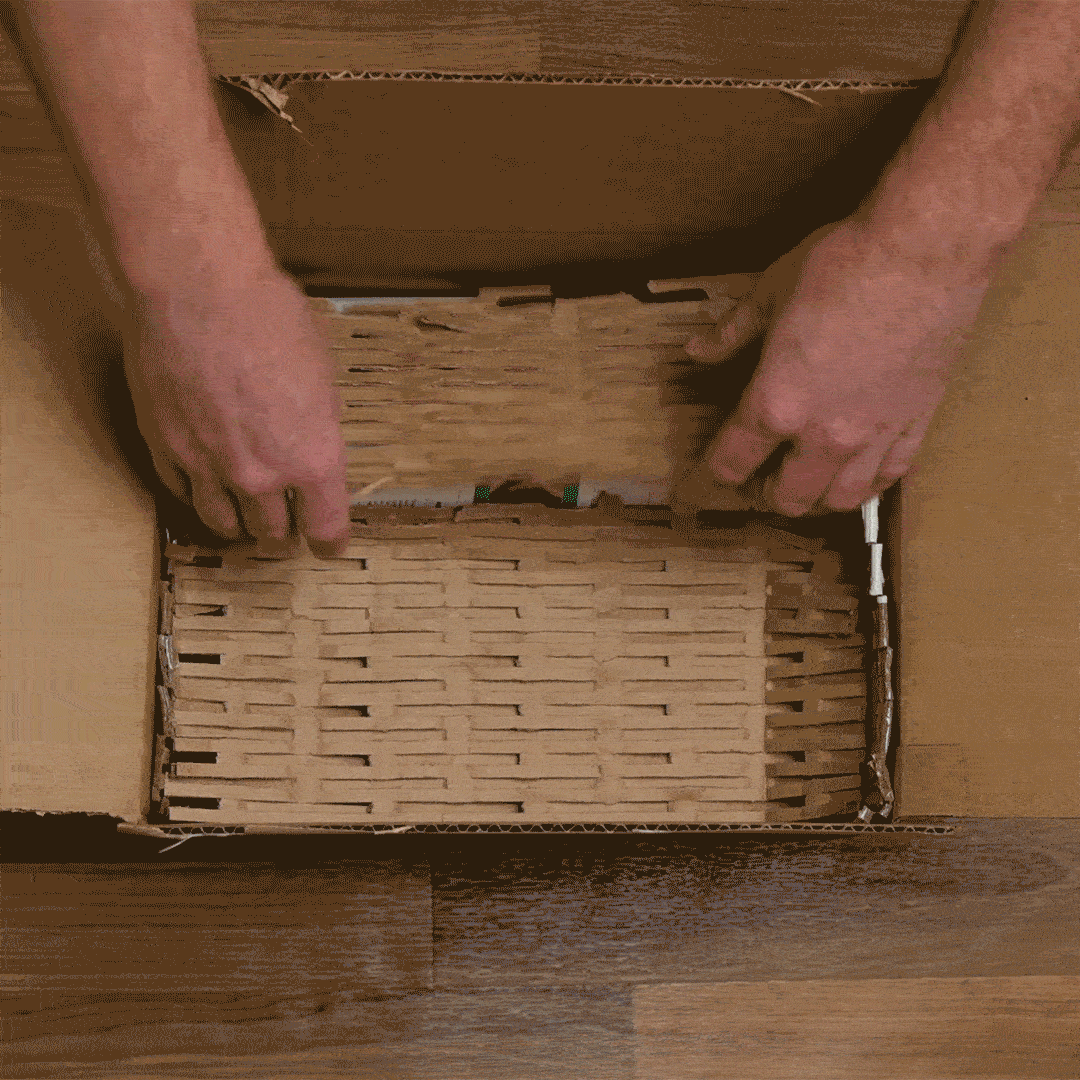
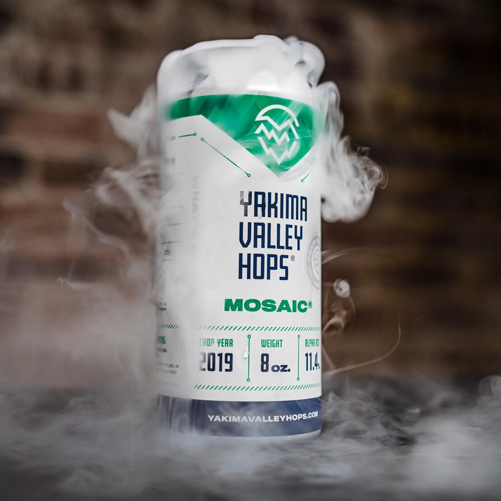
Yakima Valley Hops is an established premium hop supplier based in Yakima, WA. With access to some of the freshest hops straight from the source, they supply hops and hop products to home brewers, distributors, and breweries around the globe. I worked with them to build a refreshed identity and packaging for their unique, 100% recyclable, nitrogen purged hop containers.
Services
Identity System & Branding
Logo Design
Custom Typography
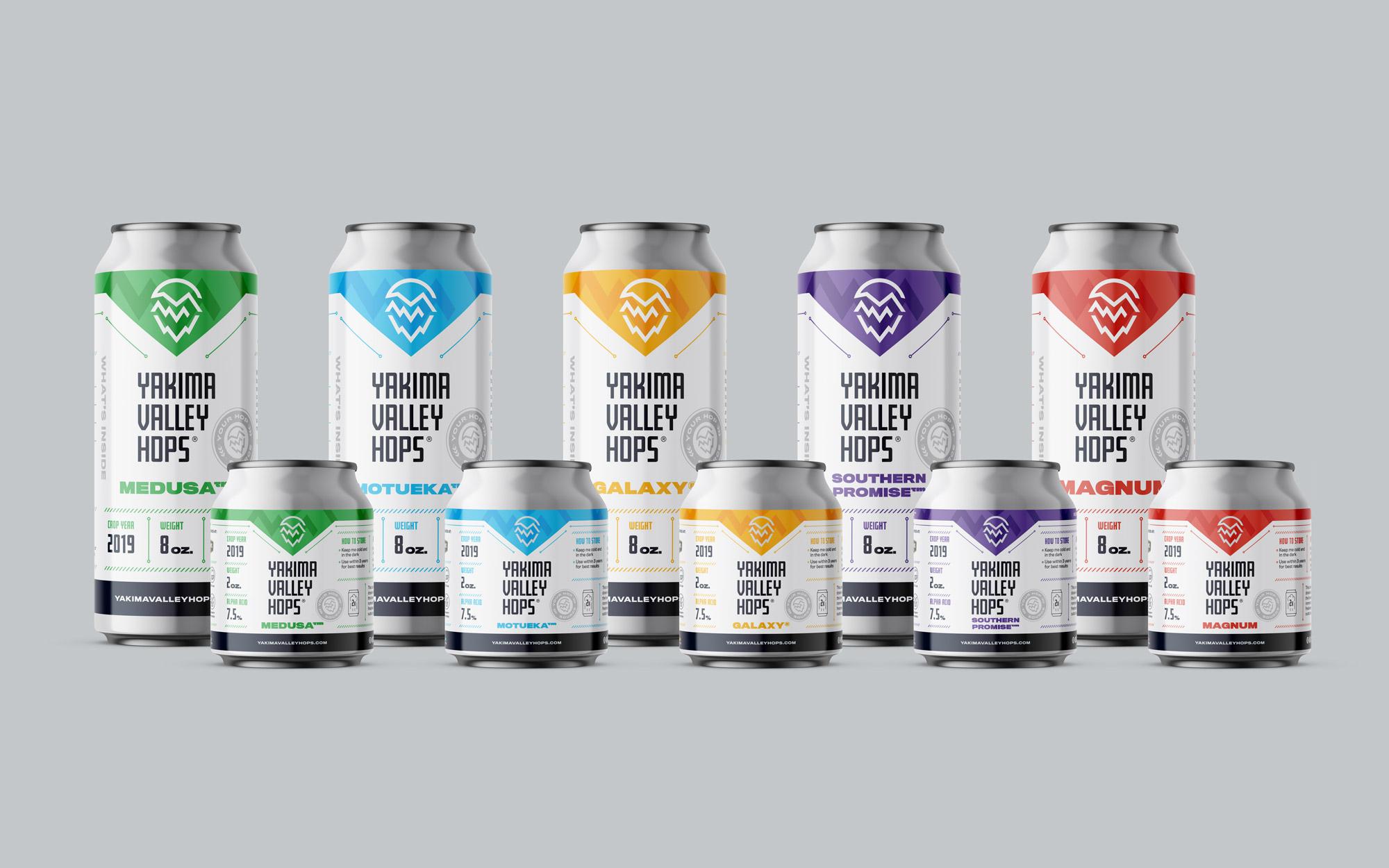
Packaging System
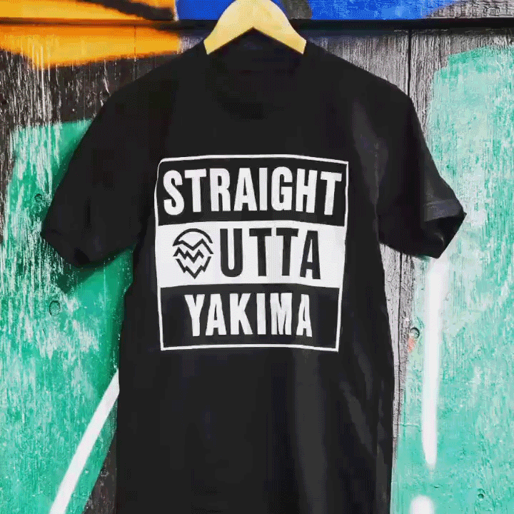
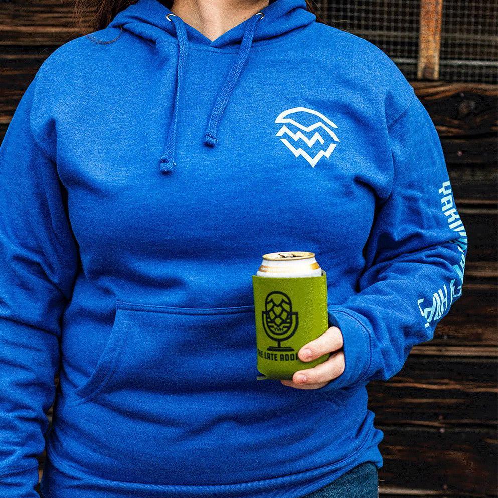
Brand Merchandise & Apparel
Art Direction
Photography > Jake Parrish > Yakima Valley Hops
Apparel Placement > Yakima Valley Hops
Challenges
When approached by Yakima Valley Hops in April, 2019, we were originally going to work on an innovative packaging solution (the hop containers mentioned above). After some discussion, we decided to visit the branding before moving forward. Yakima Valley Hops already had an identity, but their plethora of logos were inconsistent with the brand.
The challenge was to not completely abandon the existing content, but to create a cohesive identity for it to all work together. Developing a new, fresh, and sustainable logo while still keeping the brand recognizable was a key factor in this process. A total rebrand seemed to be more detrimental than beneficial, so revisiting and refreshing the branding proved to be the best option, and the easiest for Yakima Valley Hops to gradually role out.
Outcomes
The goal was to reintroduce the brand in a way that wouldn’t completely replace what existed prior, but rather create a seamless merging. The approach of the updated logo clarifies the concept of the original logo, presenting it in a cleaner and clearer fashion. It was critical for this brand to work across all of YVH’s ventures, from the newly packaged hop cans, packaging, boxes, and merch to massive signage, social, and other executions.

The hop icon.
The updated icon keeps the shape of the original, but the style has been modernized and simplified. The icon has been separated into three separate sections, each illustrating a unique aspect of the brand and what it represents.
- The top portion represents the sun and mountains/hills surrounding the valley, as well as the water that runs from the mountains and feeds the hops
- The middle portion represents the heart of the brand, the hops. The quality of the hops is critical to the success of the company, and Yakima produces a majority of the nations hops.
- The bottom portion represents the base of it all, the Yakima valley. Yakima is the heart of hop country, and without the specific conditions in the valley, the hop industry there wouldn’t be as successful.


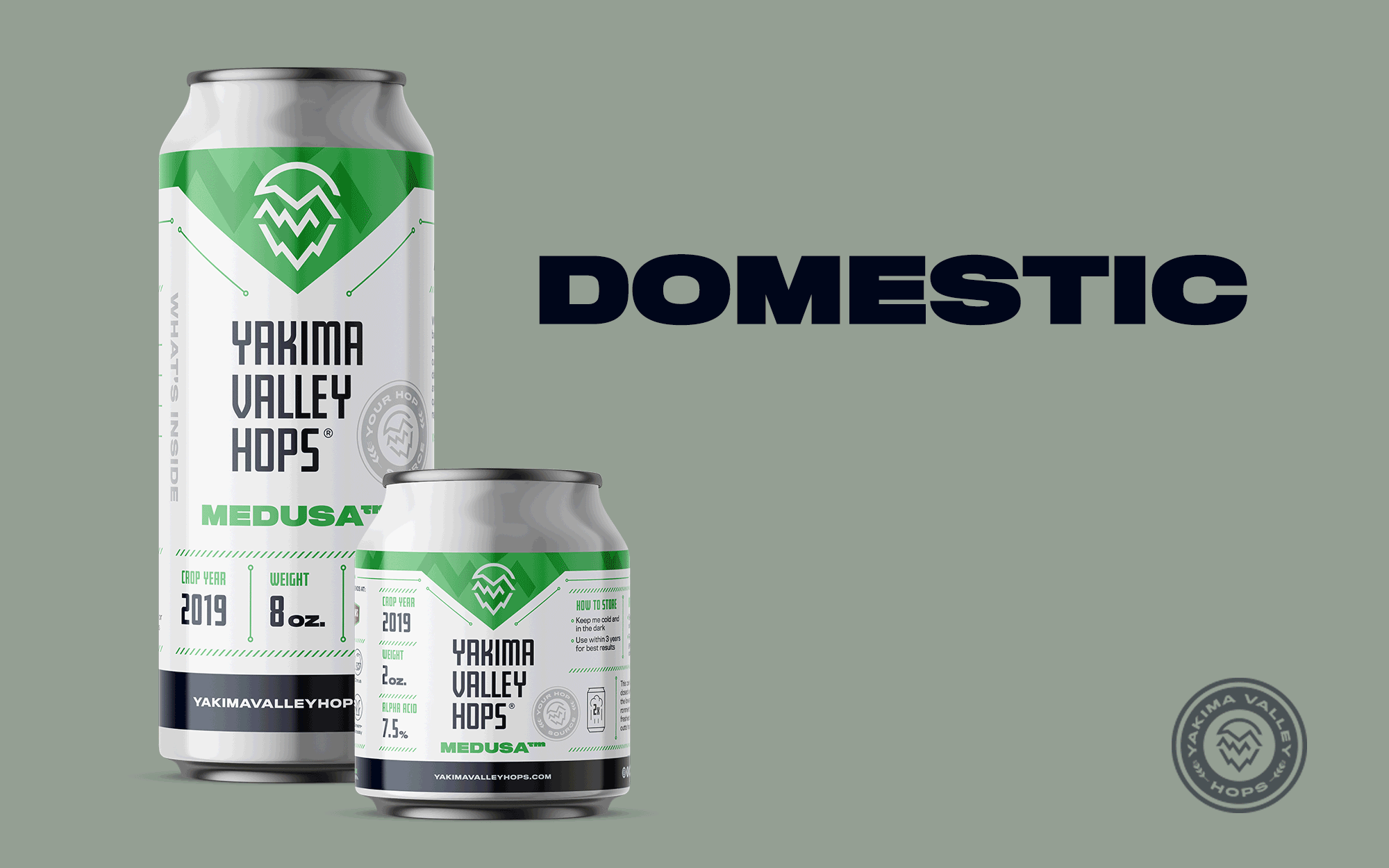
Hops from every corner.
The beer you drink is likely to contain hops from the Yakima Valley, with 74% of domestic hops grown in Yakima alone. Though there are a range of different strains in the US, there are also all kinds of hops available around the globe. Yakima Valley Hops distributes hops from the US, New Zealand, Australia, South Africa, and Europe.
When designing the can, we decided to distinguish these classifications with a color code. These colors, printed along the top of the label with the strand name, help those canning, packing, and distributing the products keep the cans organized at a glance.